
The colour scheme in this beautiful period property looks so stylish, it’s definitely one of my favourites!
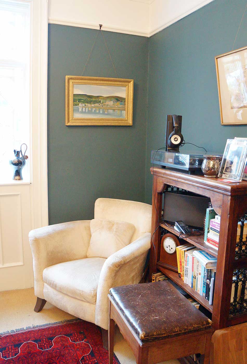
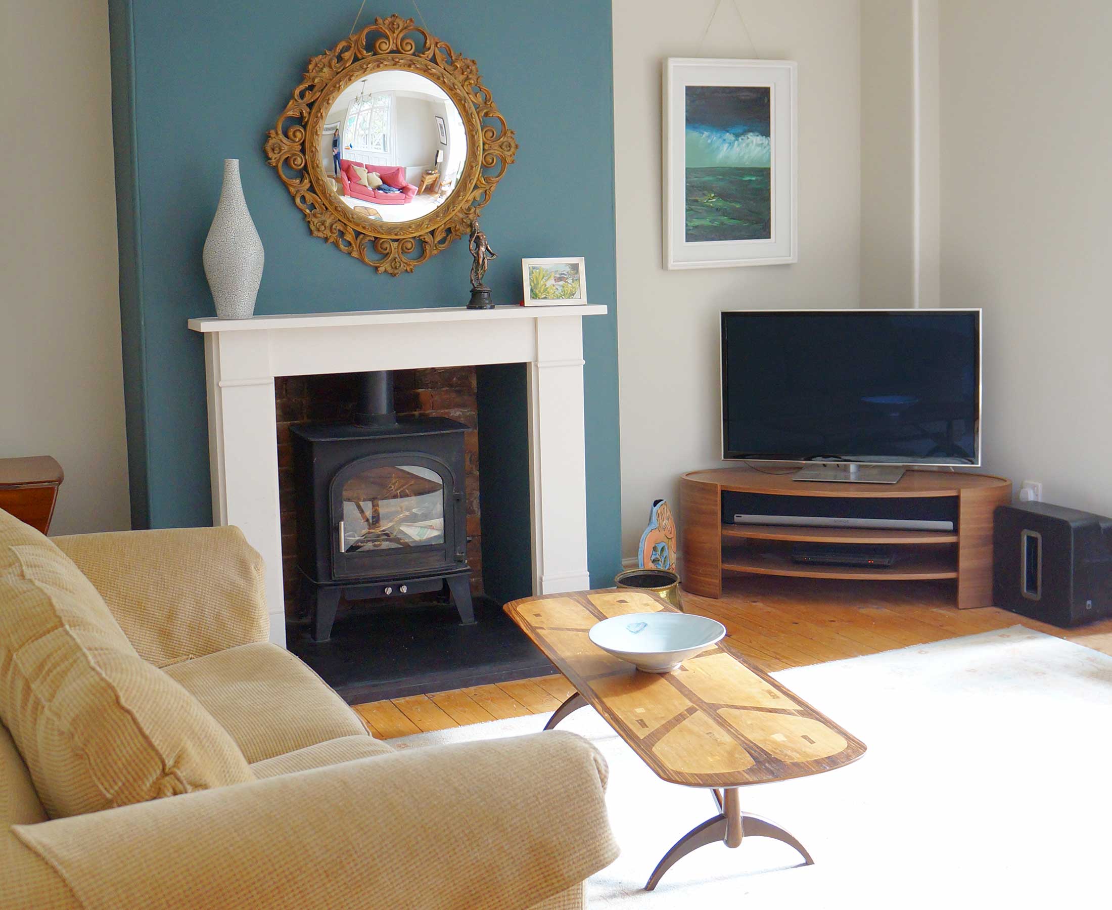
The varying tones of wood and furniture made the brief quite tricky. I needed a colour scheme to bring it together and enhance Sarah’s extensive range of artwork. I chose F&B ‘Inchyra Blue’ for the feature walls to compliment the natural beauty of the wooden floor and furniture and it’s a great contrast against the raspberry sofa and olive green arm chair.
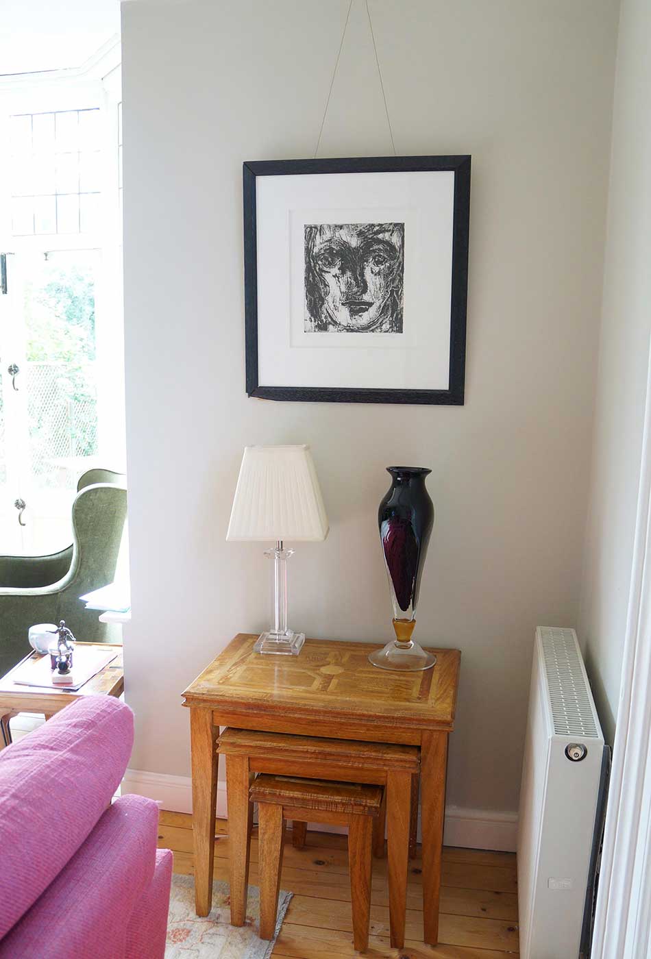
The room looks stunning and teamed up with F&B ‘Shaded White’ on the remaining walls created a match made in heaven.
I really appreciated Debs’ thoughts and ideas on how to make sense of the space I live in. She brought insight into how to make colours works across rooms creating a warm and inviting space to live in.I was impressed by not only Debs’ artistic insight, but also her very practical advice on how to stage and plan a schedule of work.